Fatal Police Violence
For the past year I've been working with Martina Morris on analyzing data on fatal police violence. Despite the fact that over 300 people have been shot and killed by police since the beginning of 2019, there is no central repository or offical goverment reporting of police using fatal force. Despite this, communities have stepped forward to crowdsource data on police violence.
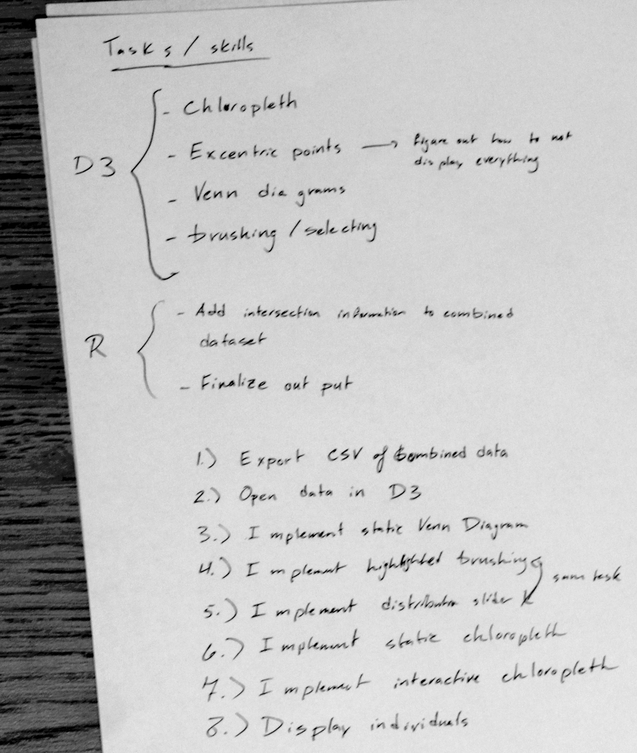
In the context of my research with Dr. Morris we've looked at four major there are 4 major datasets. I've included a static venn diagram of how the 4 datasets intersect.
- Fatal Encounters
- Killed By Police
- Mapping Police Violence
- The Washington Post
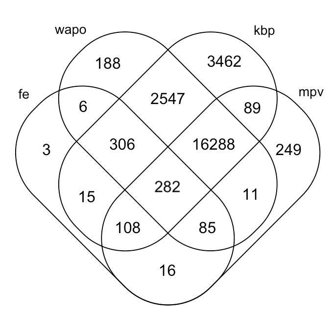
The first two (Fatal Encounter and Killed By Police) seem to be original sources. The other two (Mapping Police Violence and The Washington Post) claim to draw their data from multiple sources, including Fatal Encounters and Killed By Police. It was of keen interest to my research group to understand how individuals are distributed through these data sets both because we want to better understand where the data are actually coming from and because we want to impute any values that are present in one dataset but missing in another. However, the datasets are all very inconsistent. They each use totally different formatting, encodings, and span different periods of time.
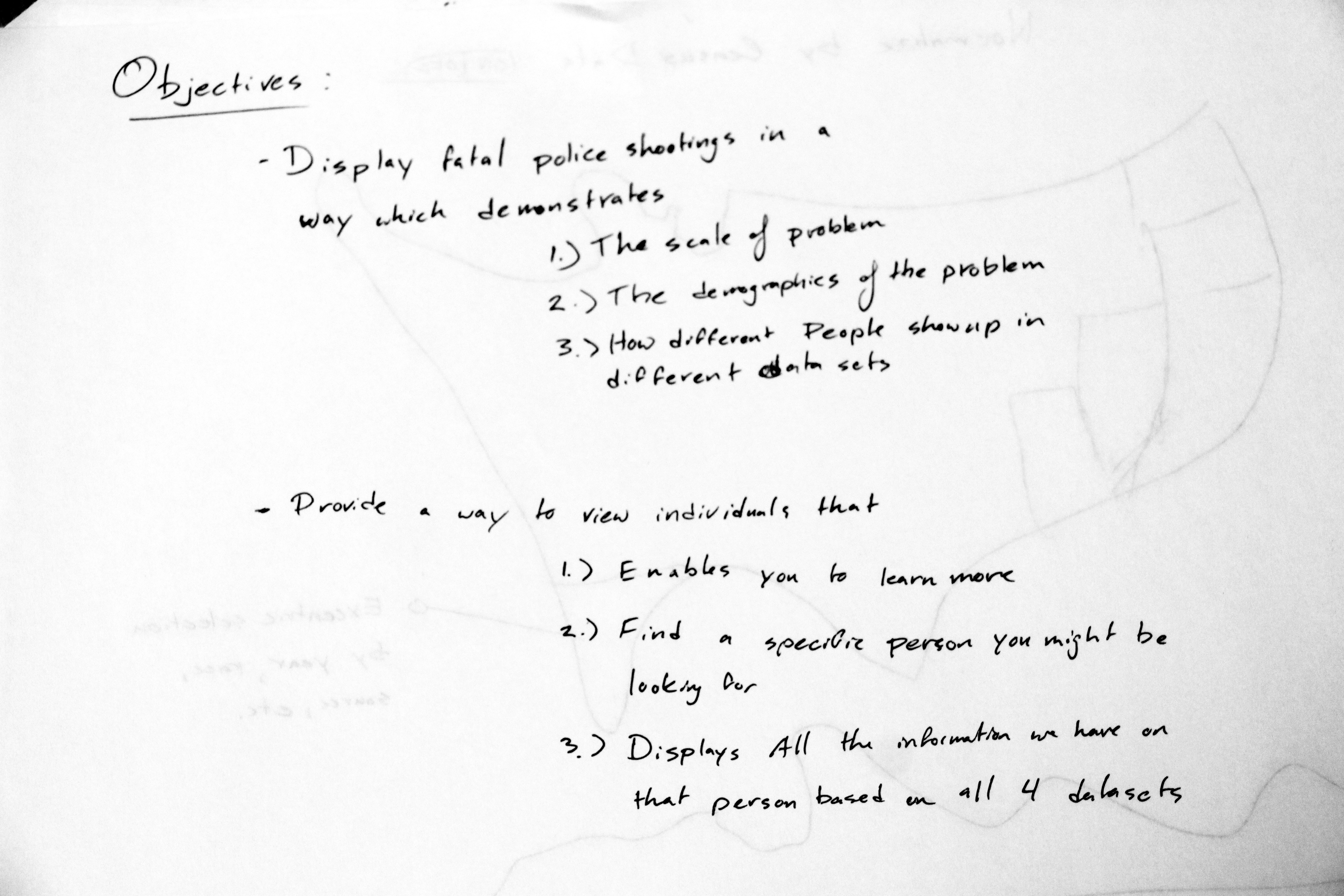
To make a year-long story short, I merged the four datasets into one unified dataset. I presented my results at the 2019 Undergraduate Research Symposium, but hadn't done much in the way of visualization. I was primarily interested in two questions:
- How does fatal police force vary through space, time, and race?
- What's the distribution of fatal force recipients through the four crowdsourced datasets we have available?
Storyboarding
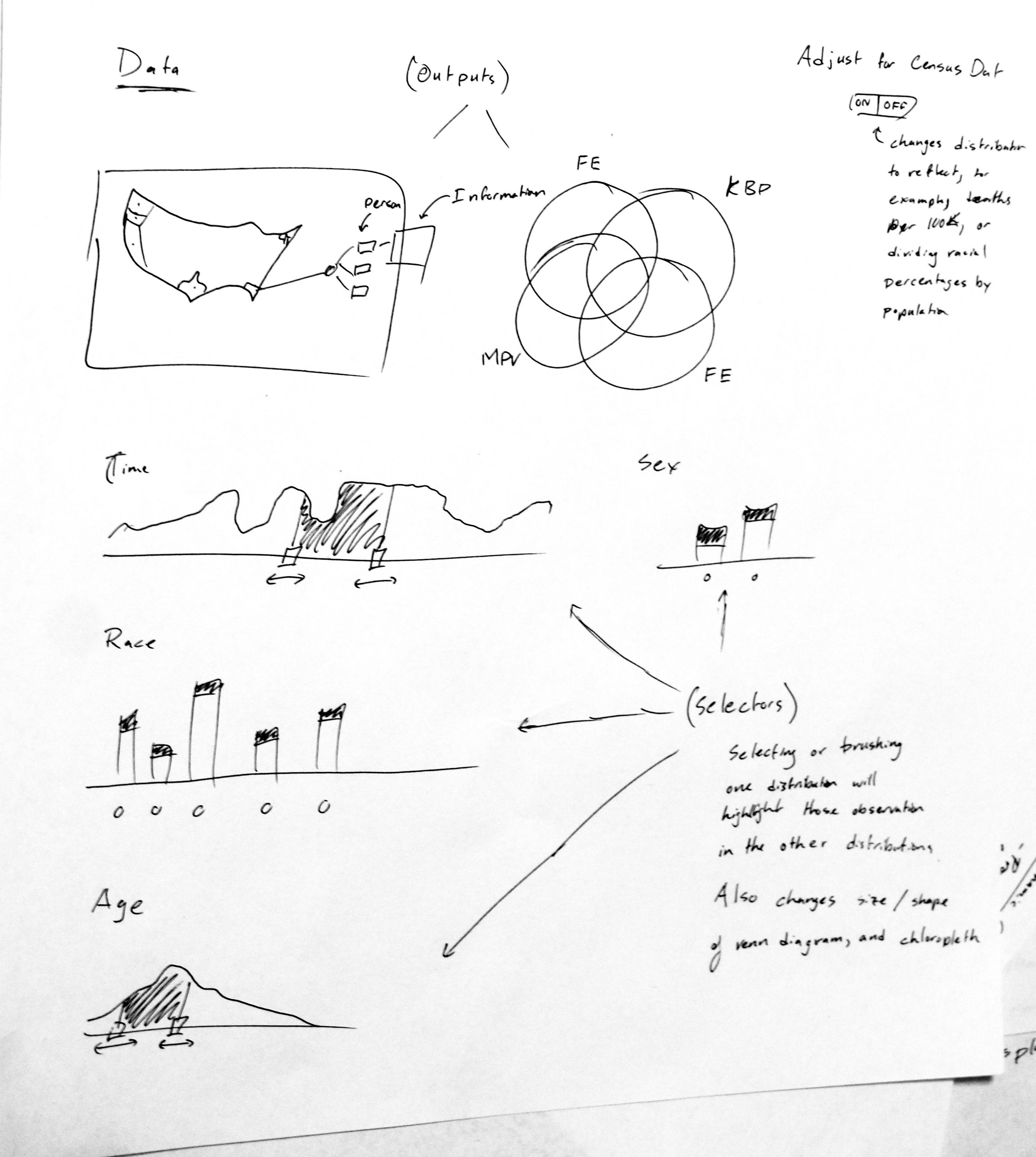
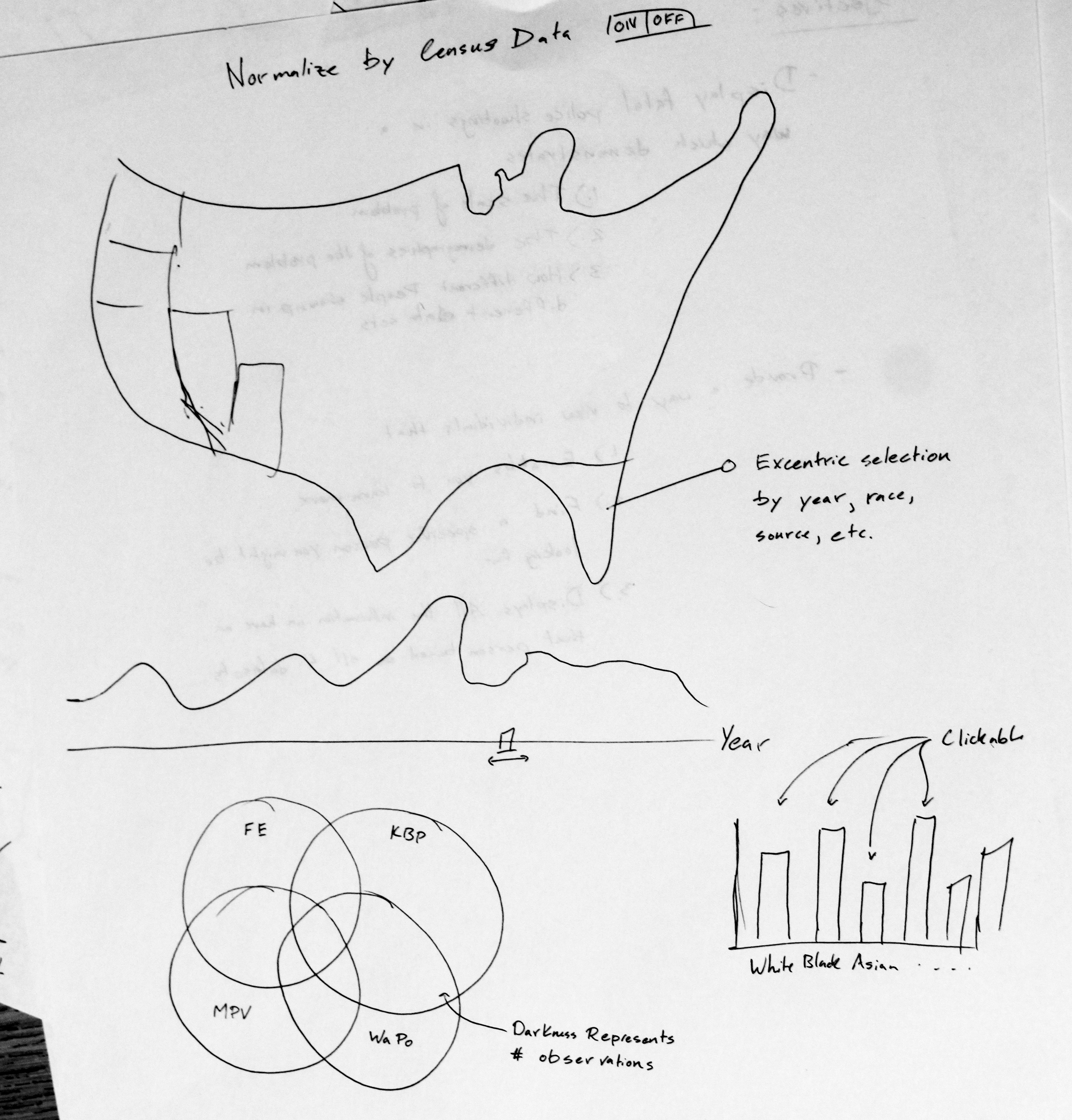
To answer those questions, I imagined a chloropleth with various sliders that would change which particular rows would be dispalyed. I pictured the data as a histogram where the bars could be selected to indicated which parts of the data you're interested in.
I also pictured a dynamic Venn diagram which would also update with the sliders. This would literally show how the data are distributed through space, time, and which dataset those data are coming from. It would, for example, let us see if there are any trends amongs young black men being shot in the south, and see which datasets are reporting those deaths.
Realized Project
I quickly realized I wasn't going to be able to do this in the time I had available, and dramatically reduced the scope of the project to just look at population-adjusted deaths across time and state. Even achieving just that took around 25 total hours to achieve.
Unfortunately, a lot of that time was spent preparing the final merged dataset, which provied valuable insights to my research, but itself didn't involve any visualizations. Even once I had clean, operable data, I still had a bear of a time munging the data in javascript. This is why I didn't include a selector for race. I couldn't get the interface to work with radio buttons and rollup in d3.
That being said, it still accomplishes a sliver of my original goal. The final product involves the following:
- A choropleth of the United States showing the number of people shot in a particular year divided by the number of people residing in that state in that year
- A slider (which is the principle mechanism that the user interacts with the application) that allows the user to select a year between 2000 and 2016.
- A scale which adjusts to the change in quintiles over the years
I chose to bin the data by quantile because this seemed to produce the most discernable geographic patterns. You can see those patterns when you slide the slider through the years.
As a side note, through the process of setting an appropriate scale, I was reminded how, despite being highly politicized, your probability of dying from being shot by the police is on the order of 1 in a 1,000,000.
It's unfortunate I wasn't able to finish this project under the time constraints, but I'm going to continue fleshing this out.